Making Graphics While Screaming at the Top of Our Lungs
So we all remember the Energizer Bunny ads from the mid-to-late-1980s, right? The first one were simply the bunny drumming and rolling and not stopping. Then, the commericals got creative; they’d start with ads for fake products and thent he bunny would interrupt (“Still going … nothing outlasts Energizer”). For its time, it was a pretty innovative idea for a commercial. I’m not going to say that it ushered in an era of humor or parody in commercials or anything; maybe it did. But there were definitely a few copycats.
The one I remember the most was, for, of all things, TV Guide.
It’s kind of weird to me that TV Guide had commercials. After all, it was one of those things that was always just … there. You know, that digest-sized magazine you threw around and sometimes read just beyond the listings (or in my case, always read the articles). But in the early Nineties, they launched their own ad campaign using fake commercials. I don’t know how many there were, but I do remember one, a music video named SKUM and the song “Screaming at the Top of Our Lungs.”
So in case you are wondering, the band in the commercial doesn’t exist. A comment from 11 years ago made by YouTube User @rhino6849 says:
This was written played and sung by Chuck Duran. We were in a band together called Loud and Clear which was quite a departure from this.Sorry to disappoint some of the metal heads but this was written with his tongue planted firmly in his cheek. I was on the floor laughing the first time he played it. Funny stuff!
p.s. That’s an actor, not Chuck.
Another user, @painebobby, adds, “Chuck sang and played guitar But did not write it.”
And even Chuck Duran himself, whom I found on the website “Demos That Rock”, has posted about it in some places. He is also a working voice-over artist who has a podcast about that work. One of his guests was E.G. Daily, which is pretty cool.
For me, the commercial still holds up, especially because of the over-the-top nature of the video. I’m not sure if GWAR was getting any rotation on MTV (this is about a year or two before Beavis and Butt-Head premiered), but that’s what it reminds me of. With a … tap … of Spinal Tap (I’ll show myself out).
Remembering obscure stuff like this is pretty much what I do here; finding out actual information about it is one of the joys I get. But also, of course, are memories. Because this commercial had such an impact on me that I actually used it for a school project.
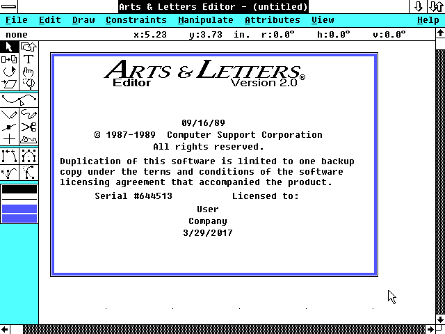
In my freshman year of high school, I took this really cool brand-new class called “computer graphics.” It was quaint compared to the graphic design capabilities we offer where I teach, but my freshman year was 1991-1992 and an IBM 486 was considered a “fast computer”. Our computer lab had 386s, one 486, and a massive “paint-jet” printer. Our teacher, Mr. Taber, had us learn basic desktop design on PageMaker (the precursor to Adobe InDesign) as well as a program called Arts & Letters.
For those of us who had loved to use Broderbund’s Print Shop in elementary school, Arts & Letters was very cool. Created by Computer Support Corporation, it took up an fair amount of space on a hard drive (seriously, the box was huge and it seemed like you had to insert, like, a dozen floppy disks into your A:// drive in order to get everything installed). More than likely, my school had purchased version 2.0 since the opening screen looks familiar.
Screen shot taken from Winworldpc.com.
With the program installed on all of the computers in the computer lab, those of us who were Print Shop veteranas had a field day with the clip art library. I’m pretty sure that I made fifty stupid signs using silly images and ridiculous fonts. That is, when I wasn’t perfecting class projects.
The NES Sports Series logo, which I cribbed for a placemat in computer graphics class.
For the Arts & Letters unit, Mr. Taber assigned a company logo (I did a terrible redesign of DC Comics’ logo), a placemat for a restaurant (I recreated the NES Sports Series logo adn used it as the centerpiece of a placemeat for a restaurant called “The Dugout), and product packaging. Not only did the packaging have to have all the necessary information about the product inside, it had to be functional.
I was such a nerd that I wound up making two packages. The first was a package for the DC Comics Cosmic Cards trading card series, and it used the logo from a previous project. When I handed it in for a grade, I had taken an entire pack of cards and put it inside the packaging.
The other? A cassingle case for “Screaming at the Top of Our Lungs.”
Like that Cosmic Cards packaging, the cassingle was designed to hold an actual cassette. At that time, I owned one cassingle–“We Didn’t Start the Fire”–and that helped me get the dimensions I needed for the project. When it was done, I printed it out (and I can’t remember if I printed it on cardstock or just taped the printout to cardstock) and handed it in with a cassette inside (no, I don’t know which cassette, probably the soundtrack to Footloose or something).
At some point, probably during one of the many purges of teenage ephemera I’ve done over the years, that cassingle project was thrown away. While it wasn’t anything amazing, I still wish I had it so that I could post it, but I can describe it from memory. I created a logo for the band that had very sharp letters and used Times New Roman for the song title and its B-side (a song I called “Very Annoying” that had a guest spot from, I think, Mariah Carey and Michael Bolton. I was kind of a little shit.). The color scheme was all primary colors and I’m pretty sure I slapped two or three pieces of clip art on there. And if you are shaking your head and thinking “That sounds like a mess,” you’d be right.
Then again, I was fourteen.
But … Brett took digital imaging as a high school freshmen and designed things that put my best work in that class to shame. So I guess “I was fourteen” isn’t the best excuse.
Anyway, I loved that computer lab in high school. I would come in before or stay for ninth period just to hang out with friends and fart around with Arts & Letters and PageMaker, working on whatever stupid side-project I had going at the time: a comic book about World War III, the ocver to a “novel” I wrote that was an R-rated teen spy movie crossed with a romance flick (yeah, I don’t know what the hell that means either, but it was called Neighborhood Spies and I typed it on my Smith Corona typewriter). And yeah, those side projects were just more on top of the layer cake that was me being a “weird” kid and made no sense to anyone but me, but that’s who I was doing it for, so … *shrugs*.
“Advanced Computer Graphics”, which I took in the spring of freshmen year, was my last class in that computer lab, but not my last turn at graphic design. I’d become a student journalist and newspaper editor in both high school and college, and spent ten years as a high school yearbook adviser (with three of them co-inciding with running the student newspaper). And one of my friends had pirated Arts & Letters, so when I got my first computer before going to college, I loaded the program on to my brand-new Packard Bell pentium computer. I had an HP LaserJet printer and would spend much of my freshman year printing out pages and pages of quotes to hang all over the wall of my dorm room. I also had a template for cassette tape labels and would make custom labels for mix tapes (which years later would graduate to making custom CD covers and back covers for mix CDs).
This all didn’t start with S.K.U.M., and I’m sure that even if I’d never seen the “Screaming at the Top of My Lungs” commercial, I would have still had a blast and made stupid stuff in computer graphics class. I guess I’m just tickled by how thse random connections work and how the most obscure things can wind up being formative.