So we all remember the Energizer Bunny ads from the mid-to-late-1980s, right? The first one were simply the bunny drumming and rolling and not stopping. Then, the commericals got creative; they’d start with ads for fake products and thent he bunny would interrupt (“Still going … nothing outlasts Energizer”). For its time, it was a pretty innovative idea for a commercial. I’m not going to say that it ushered in an era of humor or parody in commercials or anything; maybe it did. But there were definitely a few copycats.
The one I remember the most was, for, of all things, TV Guide.
It’s kind of weird to me that TV Guide had commercials. After all, it was one of those things that was always just … there. You know, that digest-sized magazine you threw around and sometimes read just beyond the listings (or in my case, always read the articles). But in the early Nineties, they launched their own ad campaign using fake commercials. I don’t know how many there were, but I do remember one, a music video named SKUM and the song “Screaming at the Top of Our Lungs.”
So in case you are wondering, the band in the commercial doesn’t exist. A comment from 11 years ago made by YouTube User @rhino6849 says:
This was written played and sung by Chuck Duran. We were in a band together called Loud and Clear which was quite a departure from this.Sorry to disappoint some of the metal heads but this was written with his tongue planted firmly in his cheek. I was on the floor laughing the first time he played it. Funny stuff!
p.s. That’s an actor, not Chuck.
Another user, @painebobby, adds, “Chuck sang and played guitar But did not write it.”
And even Chuck Duran himself, whom I found on the website “Demos That Rock”, has posted about it in some places. He is also a working voice-over artist who has a podcast about that work. One of his guests was E.G. Daily, which is pretty cool.
For me, the commercial still holds up, especially because of the over-the-top nature of the video. I’m not sure if GWAR was getting any rotation on MTV (this is about a year or two before Beavis and Butt-Head premiered), but that’s what it reminds me of. With a … tap … of Spinal Tap (I’ll show myself out).
So if you’ve been watching enough of the Paris Olympics, you’ve seen enough footage of Parisian life and culture and you’ve inevitably heard the “Can-Can.” I think it was used in the opening ceremonies, in fact. And we’re all familiar with it, right? We can even picture the dancers from a place like the Moulin Rouge doing their high kicks to the song. Well, unless you’re like me and every time you hear the tune, you hear: “Now, Shop Rite does the can can selling lots of brands of everything in … cans cans.”
Yes, I realize that I have a problem. But really, when you think of it, we all have commercials that get stuck in our heands, and I even talked about some of my most memorable ones back on episode 97 of the podcast. And on that episode, with the exception of Crazy Eddie and a Roy Rogers commercial, most of the commercials I talked about in that episode were for national brands. When it comes to this Shop Rite commercial, people in maybe five states in the Northeast/Mid-Atlantic part of the country are going to recognize that jingle, just like we also recognize character actor James Karen as “The PathMark guy”:
Again, who gets that except for people in the NY-NJ-CT Tri-State area?
I have to go school supply shopping this week, and my kid has finally hit the point in his academic career where, after years of giant, unwieldy binders filled with reams of loose-leaf paper, he’s decided to just pick up some five-subject spiral notebooks. I knew this day would come and I’ve been praying for it. The spiral-bound notebook is such a perfect school supply. In fact, it’s so great that it’s the subject of two of my favorite poems, Eve L. Ewing’s “To the Notebook Kid” and Ted Kooser’s “A Spiral Notebook”.
I encourage you to read both in their entirety, starting with Dr. Ewing’s poem and ending with Mr. Kooser’s, because they reflect upon different ends of life. Ewing’s line about “the ocean/you keep hidden in a jacked-up five star.” is about potential, promise, youth, and sets up a great closing stanza; Koozer laments, “It seems/a part of growing old is no longer/to have five subjects, each/demanding an equal share of attention,” although even he hasn’t lost some sense of that youthful wonder.
To this day, I still write drafts in spiral notebooks. It’s mostly a comfort of habit, as I’ve been filling “creative writing journals” since I took Mrs. Taber’s creative writing class in my senior year of high school; however, it’s also something that has always felt right to me. There’s something more intimate to me about writing in a notebook than typing on a laptop, and even if you don’t agree with me there, I’m sure you can agree that writing in a notebook with its lack of open browser tabs is certainly less distracting than a laptop screen.
I made the notebook transition when I got to high school as well. It’s possible that I had binders in the ninth grade, but I was definitely full notebook by the time tenth grade rolled around, having started with that classroom-issued yellow paper with blue lines in first grade off of which you could never erase cleanly before moving on to huge binders full of college ruled loose-leaf and the “Midvale School for the Gifted” Far Side cartoon blown up to 8-12 x 11 as a cover and finally to the spiral notebooks. Yes, I occasionally had to use composition notebooks, which I hated because you couldn’t tear out the pages cleanly and couldn’t fold over as nicely as a sprial-bound; and I dabbled in the Wireless Neatbooks that were not neat and usually fell apart within a few weeks after they were purchased; but those spiral notebooks became the staple of my school supply shopping*.
Most of the spiral-bound notebooks I’ve purchased over the years have been your basic-model five-subject college ruled notebooks. But every once in a while, I splurge and buy a Five Star.
With a durable plastic cover that measures 9″x11″ with 8-1/2″x11″ sheets, the Mead Five Star maintains its neatness through quite a bit of abuse; plus, with pockets at each subject divider, it’s heavier than your average spiral-bound five-subject notebook. It’s a piece of equipment, not just a school supply, and the price shows in the craftsmanship, as it’s not going to look completely destroyed by February, something demonstrated in the commercials.
Now, I probably wasn’t thinking about that when I was in high school, but I did take note of how “together” everything stayed within a Five Star as opposed to the notebooks that I had whose covers had fallen off and were stapled to the books’ first pages. Also, the amount of crap that one can cram into a locker always astonished me. My high school had the lockers like you see in The Breakfast Club: a long locker with a coat hook but also an attached “cubby” for textbooks. That’s where you shoved your lunch bag and I’m sure where a number of my peers shoved whatever contraband they were bringing onto school grounds**.
Anyway, that durability was a trademark of Five Star’s ad campaign throughout the early Nineties, and in one commercial, they managed to not only hit upon all of the “silly ways this thing can be abused” ad trope, but also the “cool Gen-Xer ’90s teen” trope (I linked the commercial here, but play-through is disabled so you’ll have to watch it on YouTube).
Commenters on the YouTube video have pointed out that this is Todd Alexander, who played Rob on the PBS series Ghostwriter. That was a little after my PBS-watching days, but it’s still a cool connection to be able to make. Anyway, what I love about this is the way that Rob is yet another “cool teen in a cool room”, living the kind of suburban life that we were all sort of living, or at least wished we were living in 1994. He’s got his earphones in, he’s got his drumsticks going, he’s got a basketball hoop set up and always makes the shot. I was never this cool. Then again, you can’t exactly be cool when you ask your parents to buy you a two-drawer filing cabinet for your bedroom.
Mead would extend the whole Five Star concept into a line of school supplies, including backpacks, making the brand a huge flex for the teens … at least according to this commercial (again, play-through has been disabled so you have to watch on YouTube).
The actor is Christian Hoff, a former Kids Incorporated cast member who has had a long career as a character actor on television series throughout the last few decades. I’m not sure who the girl in the commercial is except that they were clearly going for a Career Opportunities-era Jennifer Connolly with the look. And he’s another typical ’90s teen guy, the douche who thinks he’s all that because a pretty girl looks at him for more than a split second. Of course, the joke being that it’s his school supplies that have her attention. Is the message here that having Five Star is going to get you noticed and maybe even in with the ladies? I’m … not exactly sure. If it was, then I missed my chance because had I bought a lot of Five Star back in high school, maybe I would have actually gotten a date.
Damn cheap basic notebooks.
* To this day, I remember my first trip to Staples in East Islip. My friend Rich had bought a three-inch Avery binder with a plastic window and that’s what I’d wanted for eighth grade. It was like Randall walking into Big Choice video in Clerks. I wanted everything.
** We had the privilege of not having to deal with overzealous local police departments who thought it would be fun to bring drug-sniffing dogs into the school on a semi-annual basis. At one school where I taught, this was the “code yellow” lockdown, and oh man, I could go on about the inequities of punishment that resulted from those searches.
I spotlighted this on an old episode of the podcast, but back in the late 1980s, there was a Roy Rogers commercial that satirized the nastiness of school lunches.
The ad was controversial because of the way it punched down on hard-working cafeteria staff and was pulled rather quickly. Having been a high school teacher for 17 years now, and knowing the amount of work it takes to feed more than a thousand teenagers on a daily basis for way less money than they should be paid, I completely agree that it’s an insensitive commercial*.
If you’d asked me about that ad when I was in my teens or even my twenties, I would have given you that tired line of “Ah, people are too sensitive/you can’t make fun of anyone anymore/why can’t people lighten up and take a joke?”** I thought it was the best commercial ever produced, the pinnacle of satire. I still think it is, objectively, a brilliant ad because of the way it plays off a reputation even though the punching down is insensitive and unnecessary. The meals served in my junior high and high school cafeteria were often nasty: soggy BLT sandwiches, hot dogs with a seafoam green tint, the steamiest of steamed hams, and industrial-grade rectangular pizza that we referred to as “Ellio’s” as a way to fool ourselves every Friday. In high school, we’d have a separate walk-up window for Domino’s pizza at a dollar a slice, which is one of the saddest things I have ever had to type.
I didn’t buy lunch often, although that wasn’t always an appealing alternative. The 1980s and 1990s pre-dated our current era of thermal-lined lunchbags with ice packs, and while we all carried bitchin’ lunchboxes at the beginning of elementary school, by the time you hit fifth grade, you were more likely to be made fun of for bringing your ham and cheese in a Snoopy lunchbox. So from late elementary school to the day I graduated, I literally brown-bagged it with lunches my dad made the night before. Now, to his credit, they weren’t slapped together peanut butter and jelly sandwiches–he knew that PB&J was the worst thing to pack in a brown bag because it always got crushed at some point. These were turkey sandwiches with Alpine Lace Swiss chees on a semolina roll, ham and cheese on marble rye, or epic meatloaf sandwiches, all with a Yoo-Hoo box that had been frozen the night before so that it could thaw out in my locker and still be cold by the time I drank it for lunch. I ate well.
But I was, of course, the exception to the rule. Many of my peers had sad slices of bologna or boiled ham between half-stale pieces of white bread accompanied by a warm box of apple juice (or maybe a CapriSun if they were lucky) and a bag of Hydrox cookies. And this sadness went on for years in our school cafeteria.
That is, until Oscar Meyer changed everything.
Lunchables hit the market just as I was starting junior high school, and by the time I was in eighth grade, they were showing up more often among the “bringers” at the cafeteria table. A quick look at their history shows that Oscar Meyer developed them throughout the mid- to late-1980s as an alternative to the labor that cam with packing kids’ lunches every day. The company had conducted research with mothers, especially working moms who had school-aged children and whose commutes often made pressed for time. Oscar Meyer was the most well-known lunchmeat brand, and after the company merged with Kraft in 1988, they had the most well-known cheese brand to go with said lunchmeat. Add some crackers and you have an appealing, ready-to-go charcuterie plate that any kid would love.
At least that was the deal when they went nationwide in 1989, as the original Lunchables were a TV-dinner-esque box of cheese, crackers, and meat, although there was a “Deluxe” version that included extra meats and cheeses, condiment packs, and a mint. Those were meant to appeal to adults, as you can see in the commercial. In fact, I have to say that though I’d seen this commercial back in the 1980s, watching it now, I was struck by how basic it was. Then again, food companies in the late 1980s still thought the way to kids’ stomachs was through their parents and were aiming at them instead of the kids themselves***. That would change in the Nineties, as Oscar Meyer embraced the “Extremely Cool Extreme Kidz” school of thought.
You’ll also notice that by 1998 (when this commercial aired), Lunchables had expanded just beyond processed charcuterie. Varieties such as wraps, pizza, and hot dogs and hamburgers were part of the line, and their nutritional value was questionable at best. In fact, Lunchables became a poster child of sorts for the childhood obesity epidemic because of their fat and sodium contents****. But nutrition aside, you have to appreciate the Millennial that is this commercial. As well as this one, from 1996.
Now, I’m not going to generation shame too much here, but in the midst of all of Millennials’ current (and justified) crowing about economic hardships, we do need to remind them about how they basically had their asses kissed throughout their childhood and teen years.***** Commercials like these are presented as individualism in your lunch choices, but what they really are is a way to enforce the purchasing power that Millennials had as early as elementary school.****** They used to run minivan commercials where the kids were making the decisions on what car to purchase. You know, as opposed to having to suck it up and squeeze your gangly ass into the back seat of a Pontiac Fiero.
Anyway, Oscar Meyer really knew what it was doing here, even if these all looked really gross and I could feel my arteries hardening, blood pressure rising, and colon seizing as I watched the ads. Because it wasn’t about the food; it was more about making Lunchables seem cool to “kidz” and the thing that “kidz” wanted. Even at a young age …
This was probably the most famous Lunchables commercial, probably because it involved a cute little kid getting all hyped when he finally got the Lunchables that he wanted. And to be fair, he does fall on the “precious” side of the precious/precocious binary that commercials like this often had to navigate, but the parent in me is really annoyed here. I don’t want to crap on a kid, and I’ve never called my own kid ungrateful, but what an ungrateful little shit. Oh, I’m sorry that your mom or dad provides you with food every single day, food that’s probably a better nutritional choice than that road to a future stroke. I swear.
Plus, and this might be a “controversial” opinion here, Lunchables taste horrible. I speak from experience, having actually packing them a few times as a kid. Oscar Meyer’s cold cuts are B-grade at best, they are cut way too thick, and the crackers had less flavor than the pencils I tended to chew on when I was stressed. And the cheese? Oh yeah, thick-cut cheese left to sweat it out for four hours in a junior high locker? Who knows, maybe they have changed in 30 years, but back in the day, they were nasty.
I pack lunches every night before school and use better cold cuts; in fact, it’s possible my kid has only had a Lunchable once or twice in his entire life and didn’t like it either. But then again, it probably was never about the food and was always about the Lunchables experience.
* Huge credit, by the way, to my high school’s cafeteria staff, who did not slow down during the COVID lockdown and converted the high school cafeteria service to a drive-up, and went so far as to personally deliver lunches to classrooms during hybrid learning when the cafeteria seating was closed by mandate. They should be paid double and I’m not kidding.
** Somewhere, I have a long rant about the enormous amount of immaturity found in middle-aged men who constantly say these things that ties into all of the damage that bullshit sentiments like this causes.
*** This original Lunchables commercial also follows that annoying “rhyme time” trend of commercials from this era. I guess it was effective because I watched it and said, “Oh, I remember this rhyme.” But that didn’t make it any less annoying.
**** The turkey and cheddar Lunchables sold today, per serving contain 260 calories (100 cal from fat), 13 g of fat, and 670 mg of sodium.
***** I’m not kidding. Go read The Tipping Point.
******* And this should make them hate Boomers even more, tbh.
Cookies & Creme Twix are back. Well, they’ve been back for a few months now, but I recently had a chance to try them, which is something I was never able to do when they were available in the early 1990s. This shouldn’t be cause for celebration–after all, the last thing I need is more candy–but being able to just buy some when I see it at 7-Eleven is one of those aspects of adulthood that never gets old.
It’s not like I was completely deprived of dessert or candy when I was a kid–we had it from time to time but my parents didn’t keep it around the house–but while I sometimes did go down to the local drugstore to buy atomic fire balls, I usually chose to spend what little allowance I got on comic books and baseball cards. So I guess that’s why when I kept seeing commercials for Cookies and Creme Twix I was intrigued but didn’t make much of an effort to pursue them, which is ironic considering that it’s one of my favorite ice cream flavors. Or perhaps I actually did look for them on the candy racks but never found them and eventually gave up and forgot about them even if I never did forget about the commercials.
The candy made its debut in 1990 along with Chocolate Fudge Twix (at the time, peanut butter and caramel were the available flavors) and along with them came an ad campaign with the slogan “one of life’s great kicks.”
Now, there were a few commercials that were part of this overall ad campaign and while they different here and there, they share the same tone and have the same message: Twix knows what you, New Teen of the Nineties, are about. And I’m going to look at three of them because they so very well encapsulate that very early part of the Nineties where culture seemed to be half about looking for something new while also suffering from a major Eighties hangover.
So this is a very short commercial, but it gets its point across in its 16 seconds: Twix understands that it sucks to get friendzoned and it’s the cure for those relationship woes. Here, we see Rick, who is on the phone with his girlfriend. And Rick’s obviously a fun-lovin’ guy. He’s got that “I woke up like this” sufer/skater hair, the type that took considerably less effort than the Aqua Net-laden hair of your average Long Island mall rat but looked a lot cleaner than that of the Nirvana and Pearl Jam disciples that would populate his high school a couple of years later.
I’d say the shirt is probably a Quicksilver shirt because they were all over the place around this time, although the ones I owned weren’t striped but had random patterns. And speaking of random patterns, can we talk about the sheets here? These were pretty much the type of sheets that teenage boys were issued back in the Nineties–neutral, earth tone colors with some sort of innocuous geometric pattern that was chosen off a shelf at Linens n’ Things because it was the only non-pastel or flowered comforter and sheet set available.
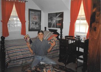
I’m serious about this. Here’s a picture of me when I was sixteen, showing off my comics collection (I don’t know why I took it, either, but it is one of only a few pictures of me as a teenager that survived). Behind me is a striped bed spread that I’m pretty sure I got when I was in junior high but really looks like I might have been sleeping in it when I was eight or nine. So the issue was not really finding bed linens that conformed to gender norms; it was more like it was hard to find bed linens that were mature because everything that was “mature” at Linens n’ Things was some floral Laura Ashley print.
I mean, at least Rick had earth tones in 1991. I wouldn’t get earth tones until college, which you can see here in this shot of my dorm room circa September or October 1995. And I’m being completely honest when I say that this was the only comforter and sheet set that I could find at the store. I also can’t let this picture get posted without pointing out how it is, in itself, the epitome of the college experience in 1995. From the Sega Genesis on my roommate’s dresser to the ROLM phone under my Reservoir Dogs poster, there is so much I could talk about that it’s pretty much its own post*. But right now, I have to get back to Rick.
So, Rick’s friendzoned and breaks the fourth wall with a WTF that I swear I not only had but that I will admit to practicing.
Yes, I said it. Then again, I watched Ferris Bueller’s Day Off, Parker Lewis Can’t Lose, and Saved By the Bell all the time in the early 1990s and every guy was giving us an aside. How could I not raise an eyebrow or give a strange look to a camera that wasn’t there? No, I’m not insane.
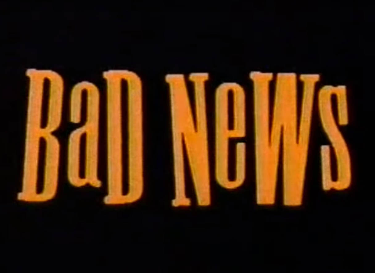
ANYWAY, two Bill and Ted type guys voice over the words “Bad News”, clearly showing the public that marketers either saw the Bill and Ted movies or had spun the “wheel of teenage cliches” and landed on … well, let’s just say this is very Poochie.
And let’s discuss this font and color scheme for a moment. We’ve clearly moved beyond the bright blues and pinks with scripted writing that we tend to associate with the Eighties (or at least that’s what shown to us in Eighties retro stuff) and have settled for a darker color palate, which is on trend for the Nineties. After all, you can look at just about any music video from around this time and will see that while they still maintained some sort of gloss, the tones were darker and deeper. So we’ve got a black background with kind of an orange-yellow “Bad News” that is written in a serif font with alternating uppercase and lowercase letters in a shaky setting. It’s very “cool”, right? Or at least what someone in marketing thinks the kids think is cool.
Which, by the way, is the inherent problem with most advertising directed at teenagers and twentysomethings in the early 1990s. Those of us who went to high school during 1990-1996 or so** were the very tail end of Generation X (a term that really only came to prominence at that time as it is) and whereas ads aimed at twentysomethings failed so spectacularly, people wrote all the think pieces, those aimed at high schoolers were a shit show, albeit a different kind of shit show where people slapped Nineties onto Eighties coolness complete with kids plucked from the same “cool kid” template that spawned Zack Morris.
Take this one, for example:
Now, this screams Eighties hangover, right down to the use of Yello’s “Oh Yeah”***. I didn’t screencap any images from this one because the resolution was pretty poor, but there are three dominant images: a girl partying at a huge house, a guy in sunglasses floating on an inner tube in a pool, and a guy with slinky-eyed glasses at a graduation ceremony. They all contrast with voice overs that are straight from the “Things Parents Say” block on the $100,000 Pyramid. And now, don’t get me wrong, I like some good teenage rebellion, but this really smacked of Poochie. Did whomever wrote this ad just rent a bunch of ’80s flicks from the video store to get the images they needed to tell teenagers “Hey, Twix knows life has to be fun.”
I guess I also need to bring up the Twix narrator’s voice, which is a guy with a generic “island” accent. It’s cringe-y in the same way Disney has the Castaway Key guy say “Cookies and Cookies Too”. However, I remember Bob Marley/Jamaica/the Bahamas being this thing in the early Nineties, especially after Cool Runnings came out and white people started thinking that saying “Jamaica, mon” wasn’t offensive at all. Between that; saying “Thank you, come again” in an Apu accent; and the Asian, Black, and Latinx “accents” us white people used back then (and in many cases still do), we’ve got a lot to think about and answer for.
Anyway, getting back to the accent, I believe the thought process here was that this was cool at the time. Plus, it was just foreshadowing that we were all going to one day own one of the millions of copies of the Legend Bob Marley greatest hits CD that were issued to college freshmen in the Nineties. All of this–and other Twix commercials–were there to show us how fun and cool we could be with chocolate-coated cookie crunch goodness.
To be fair, these worked. If you were a kid in 1990 or 1991, these were your beer commercials. Not that we didn’t see beer commercials, but I wasn’t walking into Grand Union in search of a sixer of Bud Dry when I was 13. But I could totally see Twix being good for what ails me, especially since after Rick’s bad news, we got a good five or six seconds of Twix porn.
I bought the candy and ate it, by the way, mainly because I didn’t get the chance to do so thirty years ago. And it was … well, disappointing. I was expecting a creamier cream with just enough sweetness, which is what you get when you bite into a Hershey’s cookies and creme bar (and I freaking love those). Instead, this was way too sugary and did not at all complement the cookie, which in itself was too dry. I think the mistake was layering the two ingredients instead of mixing them together. That’s cookies and creme; this is creme with cookie topping.
Not that I wouldn’t eat it again, though, because despite my disappointment, it still tasted like nostalgic promise. Somewhere in the back of my mind, there is the hope that the candy in the blue package in 2020 is going to not only be the candy in the gold and brown package in 1990 (and btw, I want chocolate fudge Twix because that’s my favorite color scheme of the four packages and while it probably would also taste too sweet, I can imagine it would be good), but will take me into the cool kid candy commercial life I dreamed about when I was younger.
*Oh, it’ll get its own post.
**It’s probably 1998, but that would mean my sister winds up being a Gen X-er, but we clearly sit on opposite sides of the Nirvana-Britney Spears generational divide, so … no.
***I owned this on cassette at one point, purchasing their album Stella at a Best Buy in Baltimore in 1998. Years later, this Best Buy would be featured on the first season of the podcast Serial. For the record, I don’t know if there was a payphone.
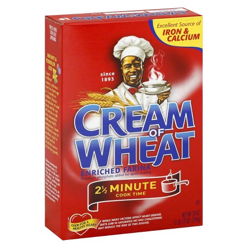
A box of Cream of Wheat in June 2020 as displayed on Target’s website.
Last year, I went to the National Museum of the American Indian in Washington, D.C. and found myself really affected by an exhibit on advertising. The point of the exhibit was to show how Native Americans have been used to sell products by simply surrounding you with those products. Floor to ceiling and wall to wall in this exhibit were packages of everything from chewing tobacco to baking powder oil with a huge television screen playing a loop of Native Americans in scenes from movies, television shows, and commercials. It was a lot to take in, but that was the brilliance of the presentation because going in, I didn’t realize how common Native American imagery is in our popular culture and advertising.
I bring this up in light of an announcement yesterday that Quaker Oats and PepsiCo will be doing way with both the mascot for and brand name of Aunt Jemima. This brand has been an everyday representation of a racist stereotype since its inception in 1889, and while there was online backlash from racists, I also saw a number of people reacting the same way I did, which was “Good, it’s about time.” Granted, I stopped buying Aunt Jemima products years ago because I make my pancakes from scratch and prefer actual maple syrup. It wasn’t hard for me to say “good riddance” because I didn’t have a relationship with the brand.
That’s not the story when it comes to Cream of Wheat, though.
Most people reading this are probably familiar with Cream of Wheat cereal, and if you’re not, it’s a porridge-type farina cereal that’s prepared similar to oatmeal. You boil some water, put the dry cereal in the pot, stir it until it thickens, and add whatever you’d like. My wife jokingly calls it “bland white crap” and yes, it pretty much is the cereal equivalent of a loaf of Wonder Bread. It is also been something I have been eating since I was a toddler, is the first thing I ever learned to cook on a stove by myself, and is something I ate the other morning the same way I have been eating it for nearly 43 years. I have a very personal attachment to this particular brand, and that’s a problem because it has a very racist mascot.
Above the logo on the front of the box is a Black chef holding a bowl of Cream of Wheat. It seems innocuous–after all, a chef is simply presenting you with food–until you understand exactly who the character is. Debuting on the brand’s original packaging in 1893, his name is Rastus, which was a derogatory term for African Americans at the time and would go on to be a name of a character used in minstrel shows. In older Cream of Wheat advertisements, he is depicted as illiterate and knowing nothing about vitamins, just that Cream of Wheat was tasty and affordable. It’s very much the male version of the “Mammy” stereotype that we have seen on Aunt Jemima bottles for years and yesterday, B&G, the company that owns the brand, announced that it is “initiating an immediate review of the Cream of Wheat brand packaging.”
Now, if you read that last paragraph and were surprised by that information or just now realized there was a Black chef on the front of the Cream of Wheat box, I would say you are not alone and that is one of the biggest problems here. In fact, I’d been ignoring the image since I was a little kid, and as I have been thinking about it, I have come to realize the damage that even the most harmless-seeming imagery can do.
There are people with way more academic credentials who have studied and written about the psychology of advertising, and I imagine they can elucidate this idea better than I can in a 1000-word blog post, but as I watched racists come with their “SJW PC Cancel Culture” whining, I saw how images like Aunt Jemima and Rastus are just as dangerous as statues of Robert E. Lee and Stonewall Jackson. They are symbols that normalize cultures of oppression and second-class citizenry for African Americans by subconsciously reinforcing the idea of white superiority.
White people would react to that statement by saying, “I’m not racist and don’t believe I am superior” and I believe they consciously think that, but that’s how normalization works when it comes to cultural and systemic racism. Normalization is a frame that allows whites to explain away racial phenomena by suggesting they are natural occurrences*. Since an image like Aunt Jemima has been tweaked over the years to be not as overtly racist, we can ignore its racist aspects and accept it as something that is just part of everyday life. As a result, the racism is an ingrained quality, and it’s why we are seeing more and more calls to be anti-racist and think more deliberately about the oppression BIPOC face in our society and then take action to change or dismantle those systems of oppression. When it comes to Cream of Wheat, this means refusing to buy more of the cereal until the mascot is done away with, and writing them to let them know (and while I was at it, telling them to re-brand Brer Rabbit Molasses).
Right about here is where a quote or a platitude would often be placed, but I think that would undermine the last several paragraphs. What I would like to see is for this reckoning with our culture’s symbols to continue. More White people need to educate ourselves about our history of racist branding and then and put pressure on those companies still using those images to change them.
*Borsheim-Black, Carlin and Sophia Tatiana Sargiganides, Letting Go of Literary Whiteness. Teachers College Press. 2019.
It’s the most self-indulgent, ultra-sized episode of Pop Culture Affidavit EVER!!!
Join me as I take a look back at the history of the blog and podcast; giving you its origin story; and respond to both emails and past blog comments on topics such movies, comics, music, and random stuff. Then I share never-before-heard outtakes and conversations with Michael Bailey, Stella, Donovan Morgan Grant, and Andrew Leyland before Amanda joins me for a brand-new segment about music from 1997 and 1998.
Plus, I introduce and preview my newest miniseries, which premieres in November!
Here’s where you can find all of the guest spots …
0:17:40 Michael Bailey and I talk about cast members from How I Got Into College and Summer School and then talk about the syndicated show Super Force.
0:42:00 Stella and I discuss our initial reactions to Alien Covenant.
1:16:05 Donovan Morgan Grant and I talk about Roboetch (in footage that did not make the final cut of our episode).
1:43:00 Andrew Leyland and I talk about Nineties music.
1:52:05 Amanda and I disuss music from 1997 and 1998.
After the cut, you’ll find links to posts mentioned in the episode as well as some extras:
They’re the 30-second segments you fast-forwarded through, ignored, or used for a bathroom break, but when you think about it, you know them better than you realize. They are commercials. In this episode, I talk about advertising and commercials that I remember, both fondly and not so fondly. I begin by going over what makes a good and a bad commercial and then make my way through a bunch of commercials that I can’t get out of my head. From cereal to fast food to toys to local car dealerships, it’s so much advertising that it’s … INSANE!
“The Yearbook Myth”: A post about yearbooks and yearbook DVD music from the mid-2000s that also features a 1980s McDonald’s commercial called “Great Year!”
“XOXO”: Tic-Tac-Toes canned pasta from Chef Boyardee.
Throughout history, we have been drawn to the great love stories, both triumphant and tragic. We cheered when Odysseus was finally reunited with Penelope and we cried when Romeo and Juliet met their fateful (though, I would argue, avoidable) ends. Yet none of those compare to the epic saga of the two lovers in a Wind Song commercial from the early 1990s.
Wind Song is an inexpensive perfume produced by Prince Matchabelli, which has been around since 1926 when its founder, Norina Machabelli fled the Soviet Union for the United States. It began making Wind Song in 1953 and the perfume has been available at drugstore counters ever since. I personally have never smelled it, so I will post the description provided by FragarenceX, where a bottle is currently on sale for $15.70:
A unique woody perfume, Wind Song was released in 1953 and has been enchanting consumers with its bright combination of flowers and spice ever since. The top notes include coriander, tarragon, orange leaf, and neroli, with gentle hints of mandarin, bergamot, and lemon. The heart opens with a flush of carnation and cloves, gently spreading to reveal touches of rose, ylang ylang, orris root, jasmine, and rosewood. The base slips in softly with the poignant scents of sandalwood and cedar, along with the faintest hints of vetiver, musk, benzoin, and amber. This refreshing fragrance is lovely for a day out in the spring or summer.
If I personally have smelled it, I don’t think I would know, which is not a knock against the perfume and more a testament to my inability to distinguish any one perfume from another (except maybe Axe Body Spray, but that’s because I teach high school). But I certainly remember the commercials that ran in the 1980s and 1990s and the famous jingle, “I can’t seem to forget you. Your Wind Song stays on my mind.”
There were a number of variants of this commercial over the years, but they more or less had the same premise. A woman wearing Wind Song perfume sprays a little bit on a letter or note and sends it a guy. He opens it, smells it, and … well, “I can’t seem to forget you. Your Wind Song stays on my mind.”
I’d imagine that if you aren’t familiar with the commercials, this description could provide you with a mental picture that is either very romantic or very awful. Wind Song could remind the guy of his lover, it could cause a terrible allergic reaction, it could trigger a PTSD flashback, or it could result in something much worse. For instance, in one of the commercials that ran during the 1980s, the woman spots her lover in a restaurant with a bunch of business colleagues and has a waiter send the note. It’s meant to be a reminder of romance, but it could also be the framing device for a flashback in a Skinemax movie, or the note could also read “I will not be ignored, DAN!”
Anyway, the commercial that I’m most familiar with, and which I mentioned briefly in my VHiStory episode, was from the 1990s and did not involve restaurants or possible Fatal Attraction scenarios.
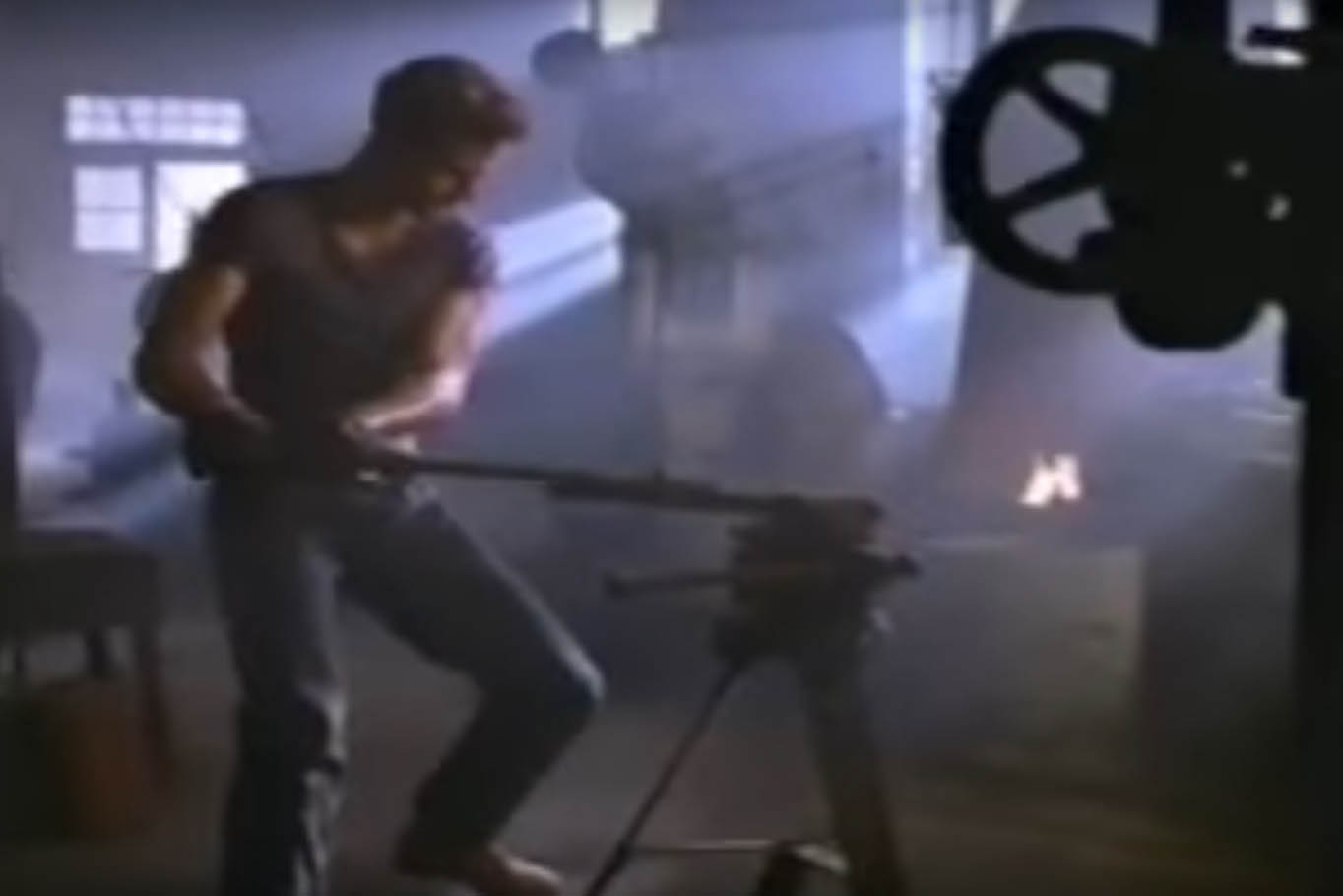
It is a simple plot, but one for the ages. We have Rick, whose biceps strategically sweat while he shapes metal into various shapes. He is just going about his day in whatever dusty shop this is, one that is run by Old Man Weatherby (a guy who has been trying to get at those meddling kids for years). But then, the shaping of various metals must stop because the mail comes.
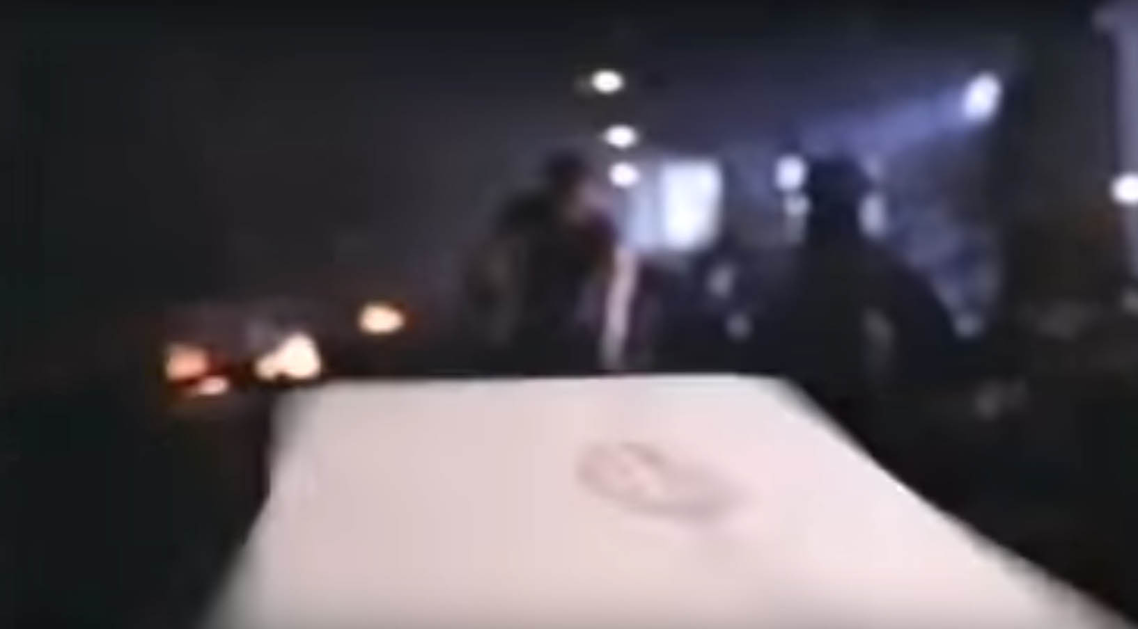
And yes, the Maguffin has arrived. It’s so important, in fact, that we get an artfully done special effect that even George Lucas is envious of with the letter flying toward him. What could be in this letter? Is it his electric bill? A notice that his metal shaping tools are being repossessed? Could he have finally gotten into Harvard?
No, it’s from Kate. She misses him and she sealed the letter with a kiss. I guess the perfume is strong enough to cut through all of the manly sweat and metal shaping smells, because Rick is definitely interested. He takes a big whiff of that letter and we cut to Kate aimlessly riding her bike on a bridge.
And she’s thinking: “Did I forget to turn off the coffee maker? I think I did. Wait, that’s not a big deal because it has an automatic shut-off. The house isn’t going to burn down. But did I lock the house? I’m pretty sure I locked the house. I remember getting my bike out of the garage, shutting the garage door, putting my keys in the … yes, I locked the house.”
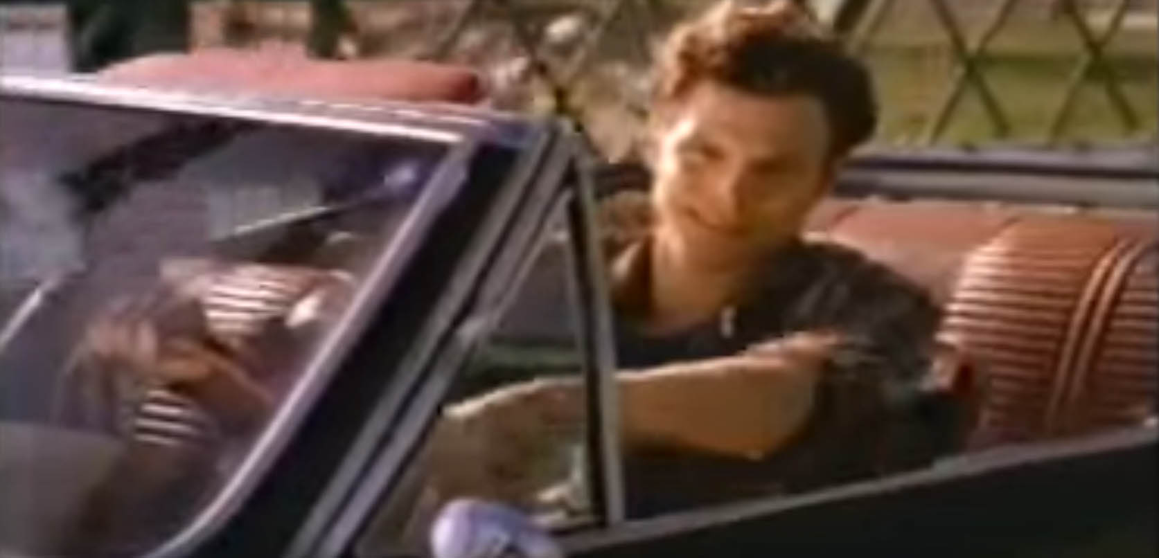
Rick is so ready that he gets into his classic car and peels out of work. He probably didn’t even put his tools away and left everything a mess. Old Man Weatherby is going to be pissed. But who cares? Kate misses him, too, and that means someone’s gonna get lucky. He then reaches the bridge where he just happens to know where Kate is riding her bike, and is all: “Hey, baby.”
Kate: “Oh, it’s you.”
Seirously, that’s the expression. Like she’s the lady in Rupert Hine’s “Escape (The Pina Colada Song).”
Well, at first, anyway, because he eventually pulls over, they have this moment where he picks her up and swings her around and they kiss and then we end with the two of them standing on the bridge and kissing. Totally blocking traffic, by the way. What if someone else was commuting home and got stuck because of these two? That’s really rude.
The commercial ends with a shot of the box and a voice-over and I have to say that I have a number of unanswered questions. What kind of force is guiding that letter? Is it supernatural? I mean, Old Man Weatherby can’t have that good of a wrist, right? And what is Kate really like? Is she the good girl and Rick is the guy they can’t stand? And where exactly are these two living where he can work in shaping metal all day and afford a classic car while she can spend her days riding her bike aimlessly across bridges?
There’s some untapped fanfiction potential in this entire 30-second ad, if you ask me. I can see entire books being written on the moments that inspired her to send the flying letter. I can see erotica depicting the ten minutes that follow these thirty seconds. Maybe there’s a literary masterpiece detailing their suburban ennui years later. Or maybe a fantasy trilogy where he actually wants to escape but she has him under the spell of her Wind Song.
The possibilities are as endless and unforgettable as their love.
The Kids R Us in the Nassau Mall in Levittown, NY. Image from siteride on Flickr.
Based on the commercials from the decade, I wonder if today’s youth is under the impression that the 1980s were just one protracted neon-lit dance number. There are several commercials from the era that were obviously a product of an advertising executive’s viewing a six hour block of Staying Alive, Xanadu, and Girls Just Want to Have Fun while hoovering cocaine because it’s the only way that anyone would think that kids singing and dancing their way through thirty seconds of television like they were auditioning for Starlight Express was cool. And ridiculous as that protracted sentence sounds, so many of us fell for it, even to the point where we would willingly go shopping for clothes.
Now, hitting the mall for clothes at some trendy store may have been a rite of passage for teenagers in the 1980s, but when you’re a kid, clothes shopping can be agony. I am not going to go through all of the details of what I was put through as a child except to say that I still only trust one person enough to accompany me when it comes to buying clothes, and that is my wife. Otherwise, I go clothes shopping completely by myself or not at all. But for a brief period in the 1980s, this wasn’t the case and that’s because Kids R Us opened up across from the Toys R Us in Bay Shore.
Existing from 1983 until it eventually went defunct in 2004, Kids R Us was the Toys R Us corporation’s foray into children’s clothing retail. This, according to a New York Times article I found from 1983, was already a very competitive market and Toys R Us was taking a big risk, especially since they were going up against huge department stores like Macy’s. From what I could tell, it worked at first because they were able to undercut their competition by offering some popular brand names at lower prices, and they made the stores themselves attractive to kids. The NYT describes one of the original Kids R Us stores in Paramus, New Jersey, as “a place that seemed to blend the essential elements of an upscale children’s clothing outlet and a suburban theme park.”
And that much was true–the color scheme of the store was bright with kid-friendly “cool” colors, there were at least a couple of distraction stations where you could play games or look in funhouse mirrors so that you forgot for a moment that you were there to try on clothes and had gotten sucked into those awesome dance numbers on the commercials:
When you watch this, you can see that it’s vibrant. Moreover, if you listen to it, it sounds like so many of the other commercials of the 1980s–in fact, I’m pretty sure that the “Kids R Us” song from this commercial is the same tune as the “Coke Is It!” ads from around the same time. This one even has a similar start to the one that I looked at a number of years ago in that it begins with set design. But then … then … THEN … it gets SO FREAKIN’ COOL.
These images are everything that was awesome about the 1980s: killer sax solos, wearing leotards 24-7 and Sha-Na-Na cosplay. People, these clothes weren’t your siblings’ or older neighbor’s hand-me-downs. Oh no. These were the clothes that you knew were going to make you be seen on the first day of school–that is, until you actually wore them to school and realized that you looked like a total moron.
Unless, of course, you are this kid. I mean, he pops his collar and doesn’t even need to ski the K-12. He just is. And I really don’t need to say much more than that. This, guys, is the impossible benchmark of cool that you will never achieve. Not back in 1985; not in 2018.
Weep for your lack.
Anyway, the commercial goes on to show more kids dancing and showing off the clothes–there’s even a couple of dressed-up nerdy-looking kids in there because there was always one parent who was always on the lookout for a new place to buy slacks–and we get to the big finale. Said big finale? A freeze-frame jumping group shot, the type that leads us kids to believe that shopping at Kids R Us will be this fun, this exciting, and that we will want our parents to bring us there right away. The reality, of course, was that we would walk into the store while catching a glance of Toys R Us and would spend the next hour wondering why we weren’t getting any toys. It was all a cruel joke perpetrated by the lies of Corporate America and our parents, who for at least a few years found clothes shopping to be a little easier.
 Cookies & Creme Twix are back. Well, they’ve been back for a few months now, but I recently had a chance to try them, which is something I was never able to do when they were available in the early 1990s. This shouldn’t be cause for celebration–after all, the last thing I need is more candy–but being able to just buy some when I see it at 7-Eleven is one of those aspects of adulthood that never gets old.
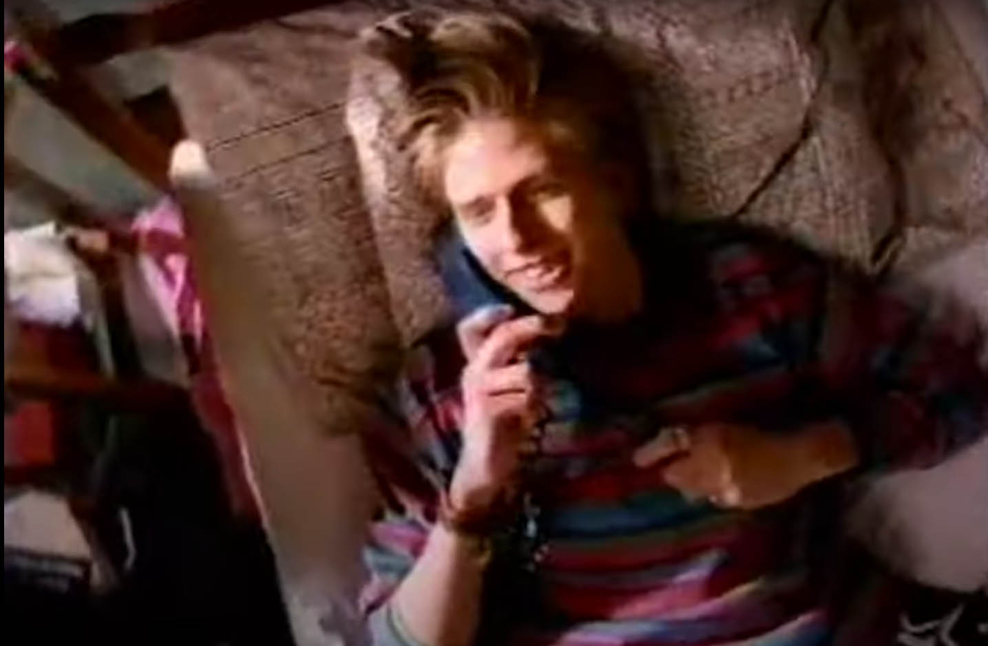
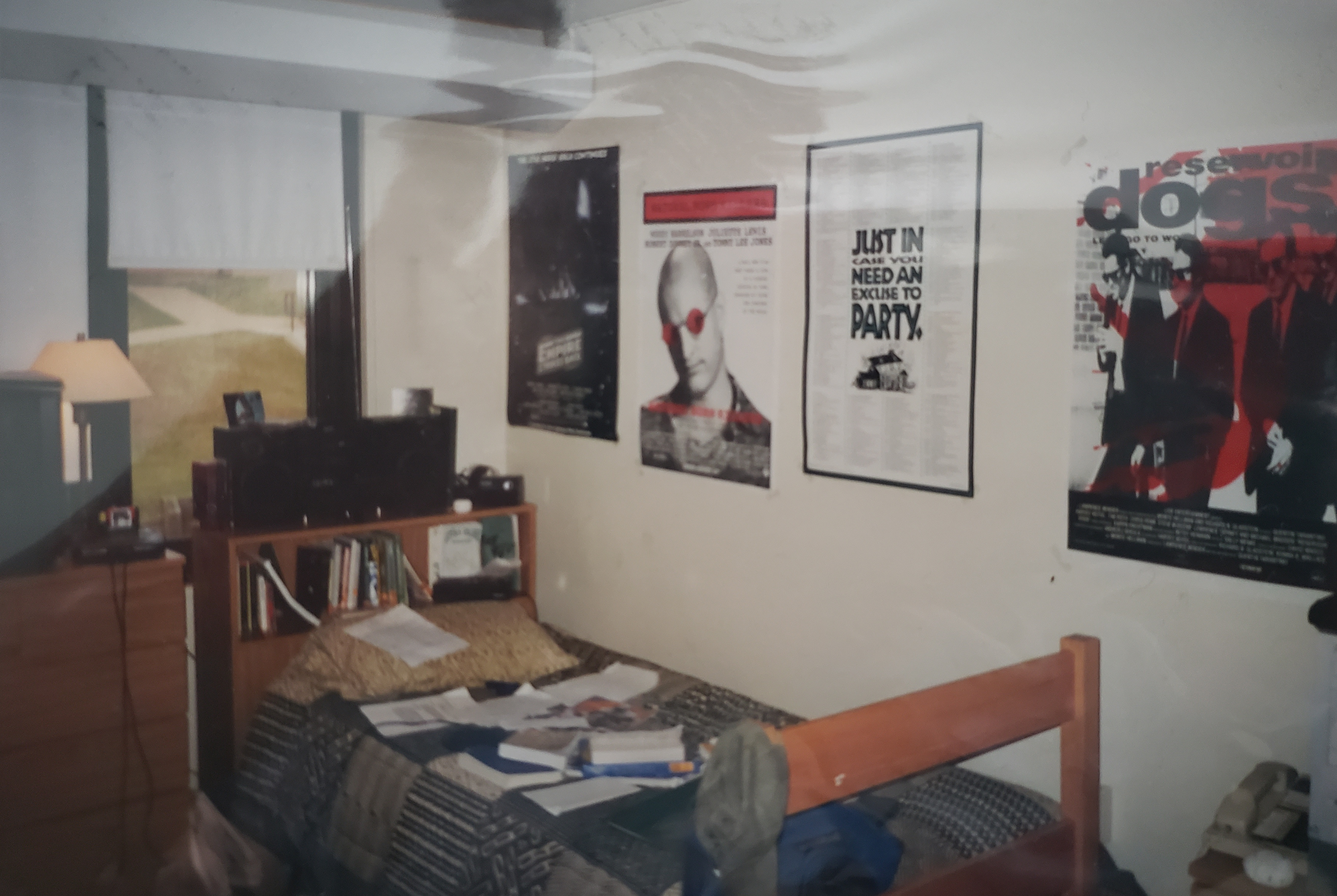 I mean, at least Rick had earth tones in 1991. I wouldn’t get earth tones until college, which you can see here in this shot of my dorm room circa September or October 1995. And I’m being completely honest when I say that this was the only comforter and sheet set that I could find at the store. I also can’t let this picture get posted without pointing out how it is, in itself, the epitome of the college experience in 1995. From the Sega Genesis on my roommate’s dresser to the ROLM phone under my Reservoir Dogs poster, there is so much I could talk about that it’s pretty much its own post*. But right now, I have to get back to Rick.

 It’s the most self-indulgent, ultra-sized episode of Pop Culture Affidavit EVER!!!
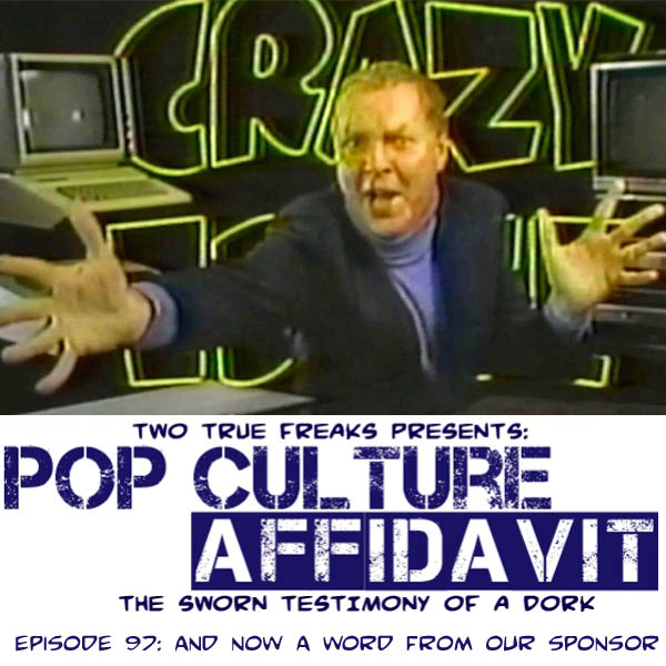 They’re the 30-second segments you fast-forwarded through, ignored, or used for a bathroom break, but when you think about it, you know them better than you realize. They are commercials. In this episode, I talk about advertising and commercials that I remember, both fondly and not so fondly. I begin by going over what makes a good and a bad commercial and then make my way through a bunch of commercials that I can’t get out of my head. From cereal to fast food to toys to local car dealerships, it’s so much advertising that it’s … INSANE!